Interview: Kelly Chilton
Kelly Chilton is the calligrapher and artist behind Lovers and Dreamers. She is a graphic designer by training and spent years working as a designer and art director. Now a calligrapher full-time with a studio in Southern California, Kelly's specialty is pointed pen calligraphy, with a primary focus on custom commissions, weddings, and other events. She loves to experiment with line, flourishing, and more recently, graphite. Kelly's lifetime loves are music and the ocean, which she often integrates into her work.
Kelly will have an art and lettering solo show in Louisville, Kentucky this summer, opening the night before the IAMPETH 2017 Conference starts. If you're in the area, it's not to be missed! Saturday, July 8, 5-8 pm; Lettersong Gallery; Louisville, Kentucky.
I interviewed Kelly via email to find out about her start in hand lettering and her advice for other freelance calligraphers. She shared with a great list of inspirations, valuable advice, and some cool personal tidbits like that she rows on a competitive masters team!
Follow Kelly on Instagram & Facebook.


Where are you located?
I’m in Costa Mesa, California. About a mile from the beach in sunny southern California. I was born and raised in North Carolina.
What got you started doing calligraphy? Did you have formal training, teach yourself, or a combination of the two?
I’ve loved making things and doing art since I was a kid. I initially wanted to be a painter, but my mom wanted me to have a job out of college, so I went into the closest thing at the time, graphic design, thinking I would still have time to paint (which wasn’t true!). I’m so grateful for the jobs and the different cities that my design career led me to, but I always did enjoy working more with my hands than on the computer. The practical knowledge was indispensable – kerning, leading, composition, the long critiques! – how print processes and the industry as a whole works – I wouldn’t give those up for anything. But I was itching to do work that was more personal and free, and I have always been hooked on the poetry of song lyrics.
Photo by Folayo Lasaki
I was taking these lyrics at the time and hand-lettering them and sometimes decoupaging them and collaging them and playing with the size of the words in my free time on weekends. One of the verses was from “You Can’t Always Get What You Want” by the Rolling Stones and it felt like that needed to be in a script because it’s sung by a chorus. But when I’d scale up certain words, the width got too big and it didn’t look right with the rest of the letters…not to mention that I wasn’t happy with the few script fonts that I could find at the time – they just weren’t that pretty or spontaneous like script should be (as a designer, I had more access to fonts than your average person.) So I signed up to take a calligraphy class just for that particular piece of mine and to solve that one problem. The teacher was DeAnn Singh, who is fabulous and generous in spirit, and whom I would wholeheartedly recommend as a teacher to anyone.
When I got there, even though it was hard (of course!) and my writing looked not technically great for a very long time (of course!), it was one of those things things that immediately that day when I started doing it, I was like “Yes. This is what I am doing from now on.” But I didn’t go into business for five years because in my estimation, that is how long it took my work to look good, with a lot of practice in between. There are a lot of great teachers around and a long relationship with a good teacher is something I’d recommend. I also have to mention Harvest Crittenden and Barbara Close because they are wonderful in that regard. And us younger people are starting to show up. Mike Ward is killing it, Schin Loong is doing her awesome thing exactly like she wants, Skyler Chubak is doing his killer lettering and Bailey Amon Rivera is amazing now. It’s a really cool time.
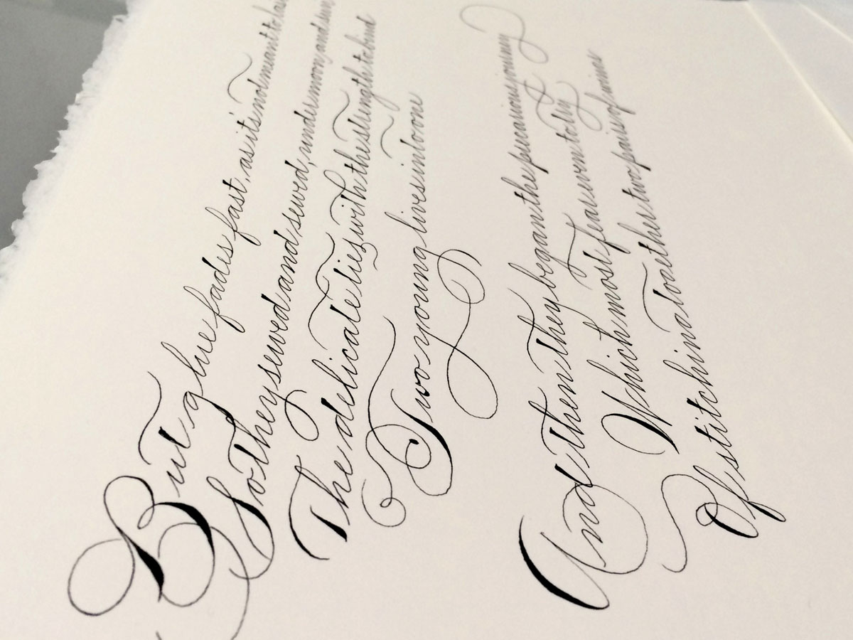
You are quite accomplished in a number of traditional calligraphy styles including Spencerian, Copperplate, and English Roundhand. What’s your favorite and why?
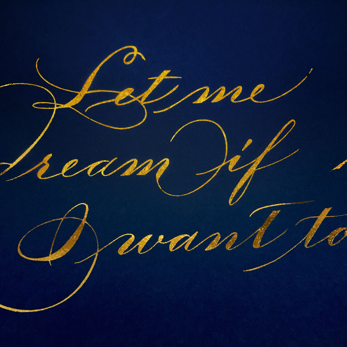
Thank you. I have a lot that I’d like to explore. I like them all in different ways and for different uses. Copperplate/Roundhand is easy to customize and is kind of a crowd-pleaser at events, so it can be a jack-of-all-trades. It’s easy to change one thing on and still get a pretty nice outcome. But overall, I think found home with Spencerian because it's faster, more my rhythm, and I think you can have more freedom and craziness in the ends and beginnings. Since I do like to try to catch a tempo, it works better with the speed of Spencerian, you can really go faster with it and be very free and pretty wild in the flourishes as long as you keep certain rules in mind, and as long as you keep a lot of air in there. With Copperplate or Roundhand, the up-and-down nature of it and the fact that you you dip in the ink so much can really slow you down although the contrast is also quite beautiful. I adore the look of a solid, crisp Engrosser’s and I keep telling myself that one of these days I’m going to do nothing but devote a several years to it and maybe even develop a fierce one to call my own but I haven’t yet.


What is your favorite type of project to do for a client? What about your favorite project to do for yourself?
This is actually a harder question than I thought it would be! I do a lot of envelopes, and actually like them – I always have. Place cards also really get my imagination going – who is going sit next to whom, and do they like each other? Are these people cousins? Are they brother and sister? I love food, so I really get into imagining what the scene is going to be like at the dinner, and who if anyone might even sneak the place card home in their purse! I also have a real fondness for the person who orders the card and envelope, for their thoughtfulness, and I hope that guests are noticing the attention to detail they are putting into giving them a beautiful event.
On the other hand, I think Good Gift Giving is a precious skill so I also love the clients who want to commission a piece for a loved one. I’ve had clients commission song lyrics, poetry for friends and family members, and I find that very touching too. I had a client who, for the birth of his friend’s daughter, wrote a poem for the baby about how her parents met and fell in love and commissioned me to write it out in Spencerian, and I almost cried as I wrote part of it – it was hard to give it away, I worked so hard on it! I am touched by it all. It’s hard not to become connected to all my clients.
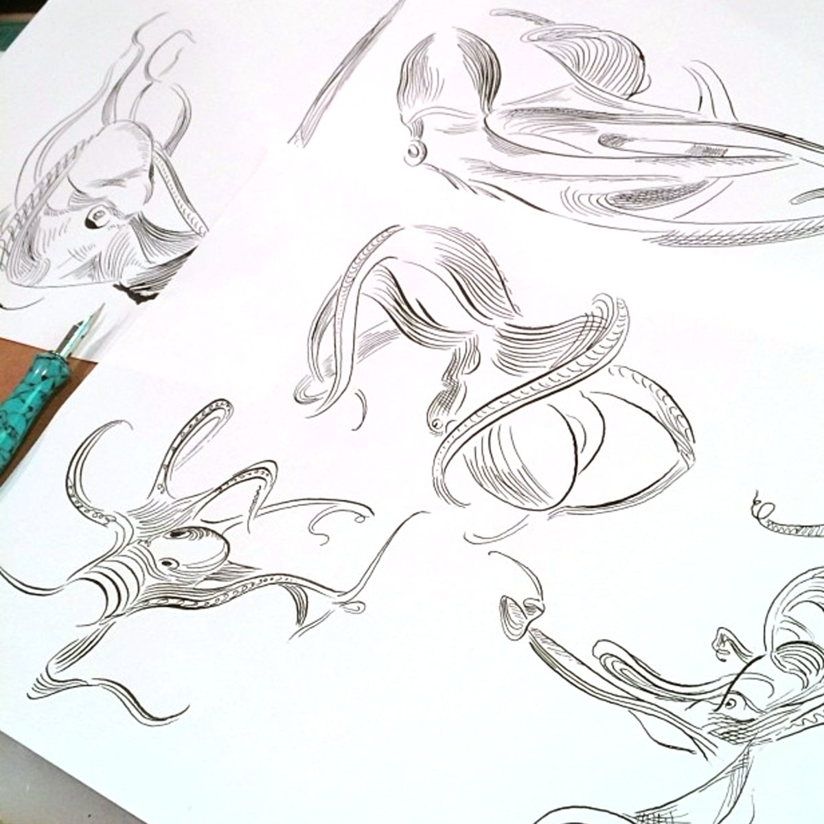
I think I already answered the other part of the question. For myself, I like to do music. The goal that I am working towards now, which is hard to put into words, is that I am trying to translate music into line, if that makes any sense. When no one’s at home, I turn the music up real loud, get some big paper, and dance around with a big stick of graphite in my hand, or pastels, or a paintbrush or whatever. Most of the time I’ll stick with the same artist or album and sometimes I’ll stay on the same song for hours trying to get different parts of the song or trying to get the rhythm just right. Or with a pen and ink — and not dancing, sitting! – I'll create new flourishes, I love to make octopus flourishes and come up with other sea creature ones. The health of our oceans and the creatures in it is on my mind almost all of the time.
Apart from thousands of hours worth of honed calligraphic skill, what are the other most important skills that a freelance calligrapher should possess if they want to monetize their craft?
I think it’s important to stick with what you do, and not necessarily just to follow trends that you see or what seems popular. Even with calligraphy, we wouldn’t have the Master Penmen if they had only come on board when calligraphy had just gotten “cool” with the mainstream again. I think it’s important not to sit around and compare yourself with other people. Just do what you do. Things take a long time to practice. I like to think that people respond to something or someone that’s genuine, so try to develop your own voice. Listen to the small whisper in yourself and go that direction and keep practicing until there’s something there with some skill behind it. But really for everybody, and I can’t emphasize this enough, it’s a lot of practice. A lot a lot. Look at work by Masters, people who have been doing it a long time and NOTICE THE DETAILS. Details are important.

Who are the calligraphers, designers, or artists – past or present – from whom you draw the most inspiration?
I had a turning point when I took a flourishing class with Jake Weidmann. I had been doing calligraphy for a while, and at that point things really gelled for me, so he is big influence and a great teacher. He’s so serious and diligent, you wouldn’t look at his work and expect that he is also funny and patient, but he is. After I took his class, I literally could not stop seeing every object in front of me how I would create them in flourishes, and I just kind of ran with it.
I had another artist and teacher this year that also really rocked my world and she is Anne Cowie. She is a calligrapher and artist and I took a mark-making class with her and I honestly still want to be doing that every day, all the time. I am doing bigger work now because of her, and freer marks in more mediums and now I feel more confident in combining marks and words and I’m closer to my goal of getting rhythm on the page. So those two people are very huge influences in two different ways. But one thing they have in common is that they like to work big and so do I.
As far as pushing the envelope and working with music, I also worked with James Fazz Farrell and that was very exciting and I am really inspired by what he does and we work the same way in how we sort of flow to the beat and just go with the rhythm and make something with the pointed pen.
My favorite painter has always been Matisse, for the way he breaks up space, his amazing use of color that still seems avant-garde to me even now and especially the way he portrayed things so optimistically, which was also a big choice at the time. I’ve always admired the sculptures of Degas in that he is trying to solve the same problems with his dancers that we are, or that I am anyway – how to represent physical motion and tension when you are creating what is a still piece. He does it beautifully.
With my graphic design background, I always loved very bold type and composition, and I love Hatch Show Print and big bold posters. They are on Instagram and I was so happy to get to visit the printing space when the IAMPETH Convention was in Tennessee.
I’ve always loved the Russian Constructivists. I think if you have any nervousness about composition in your own work, you can’t wrong looking at these. The posters are so fun and you get a real sense of the focal point that can help you in learning how to set your own composition on the page. Too much to list, really. I love Art Nouveau, Maxfield Parrish, Paul Klee, Toulouse-Lautrec, and the Japanese woodblock prints of Hiroshige – and I could ramble on.
Right now I’m verging on obsessed with the series of underwater photographs by Howard Schatz. I’m also a big fan of the illustrators Yuko Shimizu and Maira Kalman. Also: the website apod.nasa.gov, which posts a different high resolution view of space each day, Wayne White, Hugo Guinness, and the photographer Thomas Struth.
It’s probably obvious by now but I get my influence from all over the place. I follow florists, jewelry designers, interior designers, couture fashion, underwater and nature photographers…really just anything that gets my brain inspired and thinking about space and movement.


What are the top 5 lettering tools or resources you couldn’t live without?
Stabilo Pen 68
This is what I sketch with when I am not sketching directly with a pointed pen
C-Thru Ruler
My favorite ruler – just don’t cut along the edge – use a cork-backed metal one for that!
Topolino Magnetic Ink Stirrer
Lately this has been saving me because much of my client work has been in gouache or metallic.
IAMPETH for historical examples
Do you have a hidden talent, hobby, or nerdy interest that you don’t usually share?
I have a lot of hobbies – too many really. The one that takes up the most time 4 mornings a week at dawn is rowing, usually on a boat of either 4 or 9 women. It’s not much of a secret because anybody who’s friends with me on Facebook knows that any time we have a race or a photographer comes out and photographs the team, we all tag each other in a million pictures together (sorry!).
A weird hobby that not many people know: I am teaching myself the art of espalier, so that I can train some blood orange trees into fan shapes in my yard. I also really love cooking, gardening, growing flowers and herbs and veggies, going to rock shows, knitting, sailing, and SCUBA diving.
Any exciting news from your studio that you'd like to share with readers?
I’ll be featured in a solo show featuring my art and lettering that opens in Louisville, Kentucky. It is timed to open the night before the IAMPETH 2017 Conference starts. There will be live music that will feature the lyrics in my pieces. The opening is Saturday, July 8, 5-8 pm at Lettersong Gallery in Louisville, Kentucky.
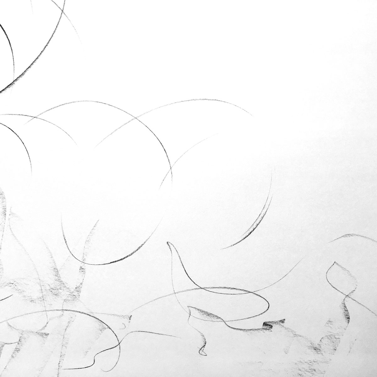


Kelly also creates beautiful 'calligraphic marks' – abstracted letterforms rendered in graphite.
Left to right: Son of Man, Talking Heads, Get By VII, Abstract 4

Molly Suber Thorpe
CALLIGRAFILE FOUNDER & CORE CONTRIBUTOR
Athens, Greece
Molly is a calligrapher, teacher, and author. Her first book, Modern Calligraphy, has reached tens of thousands of budding calligraphers, and is available in Spanish and Chinese translations. Her second book, The Calligrapher's Business Handbook came out in May 2017 and addresses the business side of lettering arts.
Molly graduated from UCLA's Design Communication Arts program in 2009 with a concentration in typography and layout design. Prior to that, Molly studied art history, comparative literature, and creative writing at The American University of Paris. After spending nearly a decade in Los Angeles, Molly now resides in Athens, Greece, where she works with clients all over the world.