Folded Pen Friday: Part 2
It’s no secret that I have a deep love for folded pens. I love all of the possibilities that lie within the tool, ready to be unleashed by the artist: rough marks, straight lines, unexpected splatters, dynamic curves and undeniable energy.
The folded pen falls within the broader category of ruling pens. Ruling pens were first used by draftsmen and cartographers, in order to draw a straight, precise line. The nib is comprised of two pieces of metal, attached by an adjustable screw. The wider one opens the metal jaws, the thicker the resulting line will be.
The folded pen made its debut into the international calligraphy world in 1995, at the Letterforum conference. The original model by Matthew Coffin is still produced today: a folded metal nib affixed into a straight penholder. The calligrapher can create thick and thin lines by simply adjusting the angle of the pen.
Many calligraphers have gone on to fashion their own folded pens, cutting nibs out of aluminum soda cans and taping them to wood dowels, unsharpened #2 pencils, chopsticks and the like. Thus gave way to the colloquial names “cola pen” and “pop can pen” (and the continuation of the regional debate of soda versus pop). Nibs can be cut into a wide variety of shapes, as evidenced by many models available. My favourite folded pens on the commercial market are the Luthis Libelula, Tim’s Pens and The Pen Artisan’s Folded Ruling Pen (see photos below). Tim Leigh had even modified the popular Pilot Parallel Pens, giving the nib a radius cut to act much like a folded nib.
Handmade nibs can be be made using the aforementioned soda cans, as well as thin brass sheets and printing plates (see below). The folded pen can be used with just about any fluid medium, from sumi ink and acrylics to watercolour and beyond. Papers with a nice tooth are ideal: cold press watercolour papers, Arches Text Wove, Gilbert Bond 25% Cotton etc.
And of particular importance: any calligraphic hand can be written using this tool from Italic and Roman Capitals to monoline scripts, gestural styles and more. Just keep in mind that the lines will often be more ragged, and ink is prone to splash. Embrace the unexpected!
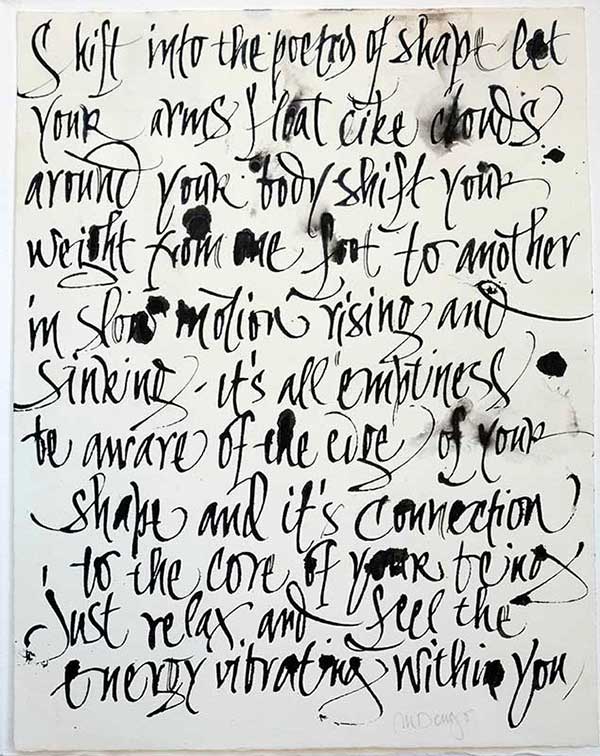
Image above: Monica Dengo

Our recent Instagram giveaway and Folded Pen Friday Post brought about many questions in regards to this alternative lettering tool, so I brought your questions to three of my favourite calligraphers: Carol DuBosch of the United States, Monica Dengo of Italy and Rachel Yallop of England.
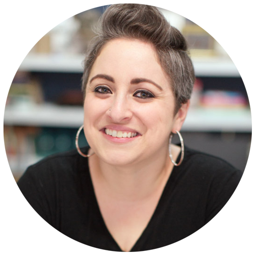
Above: Carol Dubosch
WHEN WERE YOU FIRST INTRODUCED TO THE FOLDED PEN?
CAROL: I began using the folded pen about 15 years ago, and was introduced to it by Michael Clark. Soon after, I began making my own from pop cans. They worked great. The pop cans have become very thin now, so I use brass sheeting that I can cut with scissors.
MONICA: I don’t remember. A student of mine, David Brooks, suggested me to use printing plates instead of cans and now I only use those, which I find much better.
RACHEL: It was about 25 years ago and I wasn’t quite sure about them, but then someone showed me how to make a cola pen. I immediately loved its flexibility which I hadn’t encountered before, having been used to some very stiff commercial varieties. The thing I like best is the unique line that it makes. They have a wonderful bitten edge which just isn’t achievable with any other tool. I also do a lot of work with the pointed ruling pen.
Do you prefer to make your own cola pens, or do you have a favourite ruling pen maker?
CAROL: I like them all! They each have different characteristics. The ones that I made with brass sheeting seem to be the most expressive and are likely to “spit” really well. The heavier metal in Tim’s Pens give a more controllable stroke.
MONICA: With my students we call it latta-pen (the Italian word for “tin” has replaced “cola” for a more pleasing name). I like these self-made pens because I can make many, they are cheap and can be produced in a few minutes whenever I need them.
RACHEL: I make my own cola pens from drinks can metal, but I love the folded pens made by Tim Leigh in the USA.


Left to right: Carol DuBosch, Monica Dengo and Rachel Yallop.
Which hand(s) do you like best for folded pen writing?
CAROL: I do a sloped Italic-sort of script, simple capitals and also a vertical minuscule. I also use the folded pens to do monoline and built-up forms, because I truly enjoy the rough “crunchy” stroke that I get from the folded pen. When I want this crunchy monoline, I turn the pen completely upside down.
MONICA: Gestural hands, particularly italic based hands and capitals.
RACHEL: I wouldn’t say I use them for a particular hand, though I suppose much of what I would do is italic based. I essentially respond to the word or quote and develop a fitting style.
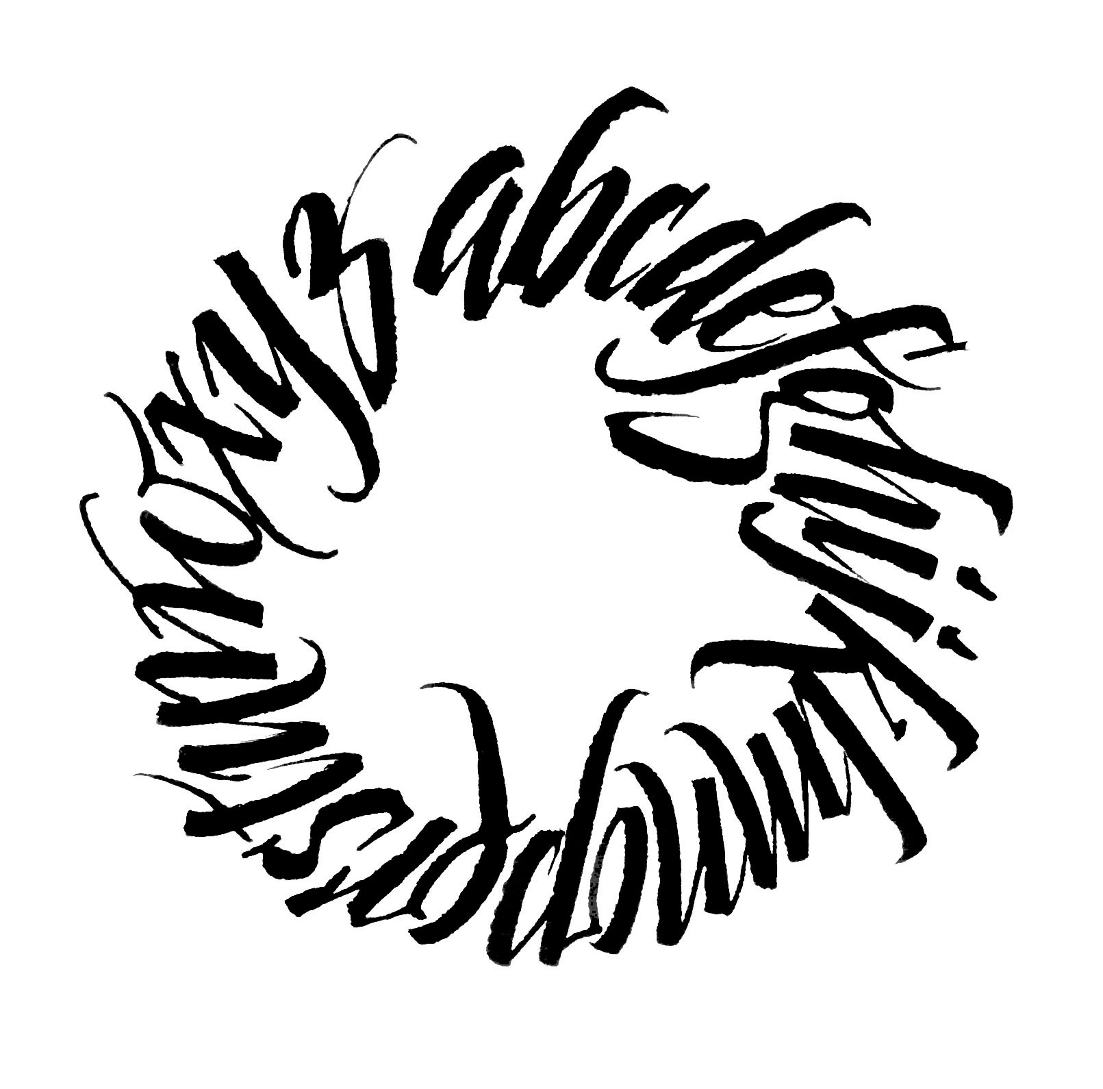
Above images: Monica Dengo
Do you hold the pen differently than when you use a traditional calligraphy pen?
CAROL: Pretty much the same
MONICA: Yes, and I move [my] arm and entire chest.
RACHEL: On the whole, my grip would be the same. What does vary however, is the angle of the pen to the paper, the position of my arm to my body and also turning the paper to achieve certain strokes.

Above: Rachel Yallop.
How does paper selection make a difference to the quality of your writing? What papers do you recommend?
CAROL: I generally like a lot of tooth to paper, and will choose cold press watercolor over smooth hot press papers.
MONICA: This pen works easily on many papers. With students I often use butcher paper on the rough side.
RACHEL: Something with a bit of texture is good. I like Canson Mi-Teintes and MBM Ingres D’Arches papers.
WHAT INKS DO YOU LIKE TO USE WITH THE FOLDED PEN, AND HOW DO YOU PREFER TO LOAD THE NIB?
CAROL: I like to dip the pen into inks, and they all seem to work equally well so it is a matter of choosing the color. I also use gouache when I want the writing to be opaque (such as white). I mix a small deep dish of gouache and dip into that with a folded pen.
MONICA: Sumi or other calligraphic inks. I prefer large containers, so the pen can be fully dipped.
RACHEL: It needs to be something very free-flowing and I often use Pelikan 4001. Schmincke calligraphy gouache is good too. I’m a dunker when it comes to loading all kinds of calligraphy pens!


The Poetic Pen (Carol Dubosch), No Day Without A Line (Rachel Yallop) and Compassion (Carol Dubosch)
Are there any exercises that you recommend for people just picking up a folded pen for the first time?
CAROL: Experiment and go slow in the beginning. The thicks and thins arrive differently from a folded pen. The simple “heavy down stroke, turn the pen for the light upstroke” is the best exercise and warm-up that I know.
MONICA: I have many exercises, but they need to be shown.
RACHEL: The folded pen is very versatile, and I think people often don’t realise this. So, I would recommend experimenting with different ways of handling the pen: raising or lowering the angle of the pen to the page, using it just on its tip or with the whole edge on the paper or writing strokes down but also up and against the paper grain.
HOW DO YOU MAKE THE PEN SPLATTER AND SPIT INK ACROSS THE PAGE?
CAROL: Hold the pen, so that the opening edge is the leading edge, not the following edge…press hard, move fast, and get out of the way!
MONICA: Lighter weight alluminum works better for these effects and a slightly rough paper may help, too.
RACHEL: You need to use a certain amount of force, or pressure and also the amount of padding under your paper makes a big difference. Just the paper on a hard surface will usually result in splattering. Also, writing against the paper grain or upwards and away from you.

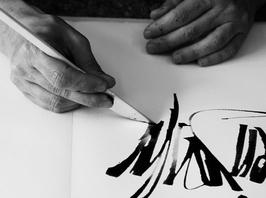
Above: Monica Dengo
HOW DOES SPEED AFFECT THE QUALITY OF YOUR WRITING WHEN USING A FOLDED PEN?
CAROL: I don’t think I’m really aware of speed, unless I’m trying to make splatter.
MONICA: It facilitates speed very much.
RACHEL: I would use varying amounts of speed depending on the letterform. A faster pace is more likely to give a splattery line, but some strokes need to be done quite slowly to achieve the desired effect. A piece of writing that looks speedy would not generally be done quickly; rather each letter stroke would be written with purpose, before considering the next.
HOW DO YOU CLEAN AND CARE FOR YOUR PENS?
CAROL: Toothbrush and water, maybe a bit of window cleaner if I've used acrylics.
MONICA: Water, and they need to be dried well.
RACHEL: Essentially, I just wipe them with a tissue. If I had been using gouache I would probably give them a quick rinse in water and then dry with a tissue. I store them in a pot, blades facing upwards.

Above: Rachel Yallop
The Interviewees
Carol DuBosch teaches calligraphy full-time in Portland, Oregon. She first encountered the edged pen and the Italic script at age 12 in 1957, and has followed the inky path faithfully by learning, teaching, promoting and practicing the art of calligraphy. She continues to be challenged by a new script, technique or art material and always discovers delightful surprises along the way. She has taught workshops throughout the country and at many International Calligraphy Conferences. Carol was Director of the 1987 and 1991 International Calligraphy Conferences held in Portland, and Co-Directed Calligraphy Northwest in 2012.
Born in Italy in 1966, Monica Dengo lived and worked in San Francisco, California from 1993 to 2003 and currently lives in Arezzo, Italy. Monica began the study of graphic design in Venice and England. In London she studied calligraphy and bookbinding at the Roehampton Institute (1991 – 1992) with Gaynor Goffe and Ewan Clayton. In 1993 she moved to San Francisco and spent three years in the independent study of manuscript production techniques, design, and calligraphy with the assistance of Thomas Ingmire. She also studied figure drawing with Eleanor Dickinson. The Correr Museum and Marciana libraries in Venice, Italy were also a part in her independent studies. From 2000 to 2003 Monica taught calligraphy and experimental typography at the Academy of Art University in San Francisco where she developed new approaches to lettering, calligraphy, and handwriting. Currently she collaborates as a curator and teacher with the Fondazione Musei Civici di Venezia, organizing international week long workshops and exhibitions.
Rachel Yallop is one of Britain’s foremost calligraphers and lettering designers. Her unique talent blends the art of expressive calligraphy with graphic design. Her love of letters stems from a lifelong passion for drawing, with her original calligraphic works exploring form, space, tension and freedom of line. Rachel studied at Ravensbourne and the Central School of Art & Design in London gaining an MA in 1985. She is an elected member of The Royal Birmingham Society of Artists, a Founder Member of Letter Exchange and an Honoured Fellow of the Calligraphy & Lettering Arts Society.
FROM JOY'S INSPIRATION LIBRARY
Speedball Textbook 24th Edition edited by Angie Vangelis and Randall Hasson. 2015.
This comprehensive manual is a must-have for a calligraphers and lettering artists. It includes detailed instructions and exemplars of calligraphic hands from medieval to modern. The book also discusses sign painting, design and layout and features inspirational images from nearly 70 leading artists in the field.
Calligraphy: A Book of Contemporary Inspiration by Denise Lach. 2009.
In this book, Denise Lach creates beautiful marks and dynamic textures inspired by nature, and an entire section of the book is dedicated to ruling pens.
Take Your Pleasure Seriously by Luca Barcellona. 2012.
This gorgeous volume should be a part of everyone’s inspiration library. It is a wonderful compilation of Luca’s work and includes numerous pieces created with ruling and cola pens.
Happy Lettering with the Right Tools by Marika Koskimäki-Ketelä. 2014.
This cheerful book is all about ruling pen lettering and includes detailed instructions about how to make a various folded pens.
Follow @foldedpenfriday on Instagram for weekly inspiration by artists from around the world!
Joy is a calligrapher, teacher and writer who specializes in pointed pen calligraphy and hand lettering. She currently serves as International Workshops Coordinator and Membership Chair for La Société des calligraphes de Montréal and is also core contributor for UPPERCASE magazine. Originally from California, Joy graduated from UCLA with a Bachelor of Arts in Theatre in 2003. She and her husband relocated from Los Angeles to Montréal in 2013.