Modern Calligraphy Nibs
One of the things I have been struggling with in my lettering practice is being able to identify a nib once it is in its holder. Even though I feel like I thoroughly clean my nibs after each use, there’s always ink that hides the nib identification and the nib holder hides the other part. I don’t know about you, but I have the hardest time removing my nibs from the holder. I have even tried the suggested jewelry pliers and only succeeded in breaking my nib in the holder, thus rendering it useless and almost losing an eye. In these novice stages of my lettering adventure, it’s important to me to know which nibs I am enjoying so I can reference back to them for the future, if I can’t read what they are (and trust me it is hard enough without ink on them and being hidden in the holder) then I am working blindly. I decided to start from ground zero and replace nibs + holders and use a label (a sheet of label paper cut to size). I am so happy with this system! Eventually I plan to create a chart so I can reference the different effects I can achieve with each nib. This may seem like a lot of extra work that you aren’t up for and you may wonder why I have so many different nibs. In this nascent stage I want to find the nibs that work best with how I create my letterforms. I am very heavy handed and a flexible, ‘bouncy’ nib creates a completely different look than a stiffer nib for me. I haven’t been doing this very long, but I feel like I have already outgrown some of my earlier nib favorites in favor of nibs that respond to my heavy-handedness. My main goal for the identification system is to be able to have a quick reference so I can re-create a look. I also want to reiterate that what I am doing is not traditional calligraphy (although I admire that very much), although I do reference traditional calligraphy techniques like using guidelines and referencing calligraphy specimens. My goal is create my own hand(s) and thus the need/desire to experiment with multiple tools (nibs).

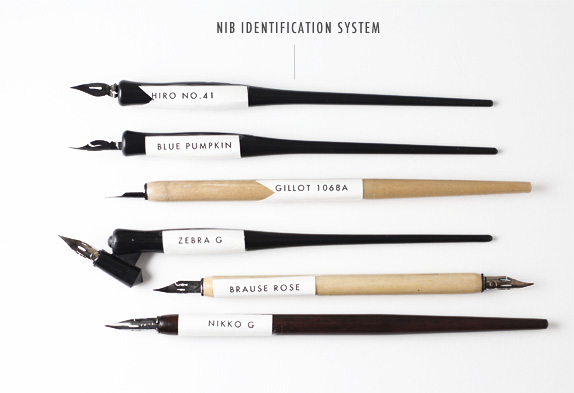
Since I get this email about 20 times a day I thought I would make sure I included my current favorite nibs, these most likely will change in the coming months but these are the ones I have been gravitating towards and why:
Hiro Leonardt No. 41 — I would not suggest this for a beginner, it is very flexible and delicate. This is my favorite nib to create loopy girly letters, it makes loop forms like a champ.
Blue Pumpkin — This seems to be a favorite ofmodern lettering artists/calligraphers (for good reason) such as Meredith Bullock of Hazel Wonderland. Both Poppy Pedals and Holly Hollon love it for cotton envelopes which have a lot of pulp. It is similar to the the above nib, a little stiffer. Again, this may not be the best nib to try if you are just starting out. I feel like I can control this nib well when I want to create very thin hairline strokes and a balanced down stroke. Sample lettering.
Gillot 1068A — I honestly don’t remember why I bought this, a mistake? Perhaps. It has turned out to be a happy accident. It’s very stiff and I would recommend for an advanced beginner. It works best on smooth surfaces so if you have any texture it will catch. You can get very nice angular/sharp letter-forms with this nib. Sample lettering.
Zebra G — I can’t recommend this nib enough. If you are starting out buy this nib, please. It’s a little more flexible than the Nikko G (these two are very similar). It’s a nice stiff + smooth nib. When you are starting out with your lettering/calligraphy practice you have so many new things to worry about (angle, pressure, inking, substrates, etc.) just make it easy on yourself and get a nib that won’t be too wonky in your newbie hands and that won’t get caught on your paper and cause messy disasters. You can create nice fine hairlines (which seems to be what calligraphers around the globe covet). As long as I am lettering this nib will be in my lettering rotation.
Brause Rose — I have mentioned this nib before, I LOVE it! This nib is very flexible and the nib I go to when I want to re-create an almost brush like stroke, the upside is that it can also create very thin hairlines. Again, not a beginner nib (stick with stiff nibs), but it is a nib that you may want to add to your nib arsenal if you love the look of brush lettering but can’t get the hang of using a paint brush to letter. Sample lettering.
Nikko G — This nib is so similar to the Zebra G and the reason I mention them both is in the off chance you can’t find one or the other you have options. Stiffer than the Zebra G, again a great nib for beginners. I really love Japanese nibs they are precision cut, the Nikko G by hand! So smooth–like butter. This is another nib that is in regular rotation. Advanced letterers will love this nib as well.