Karla Lim • Written Word — Part I
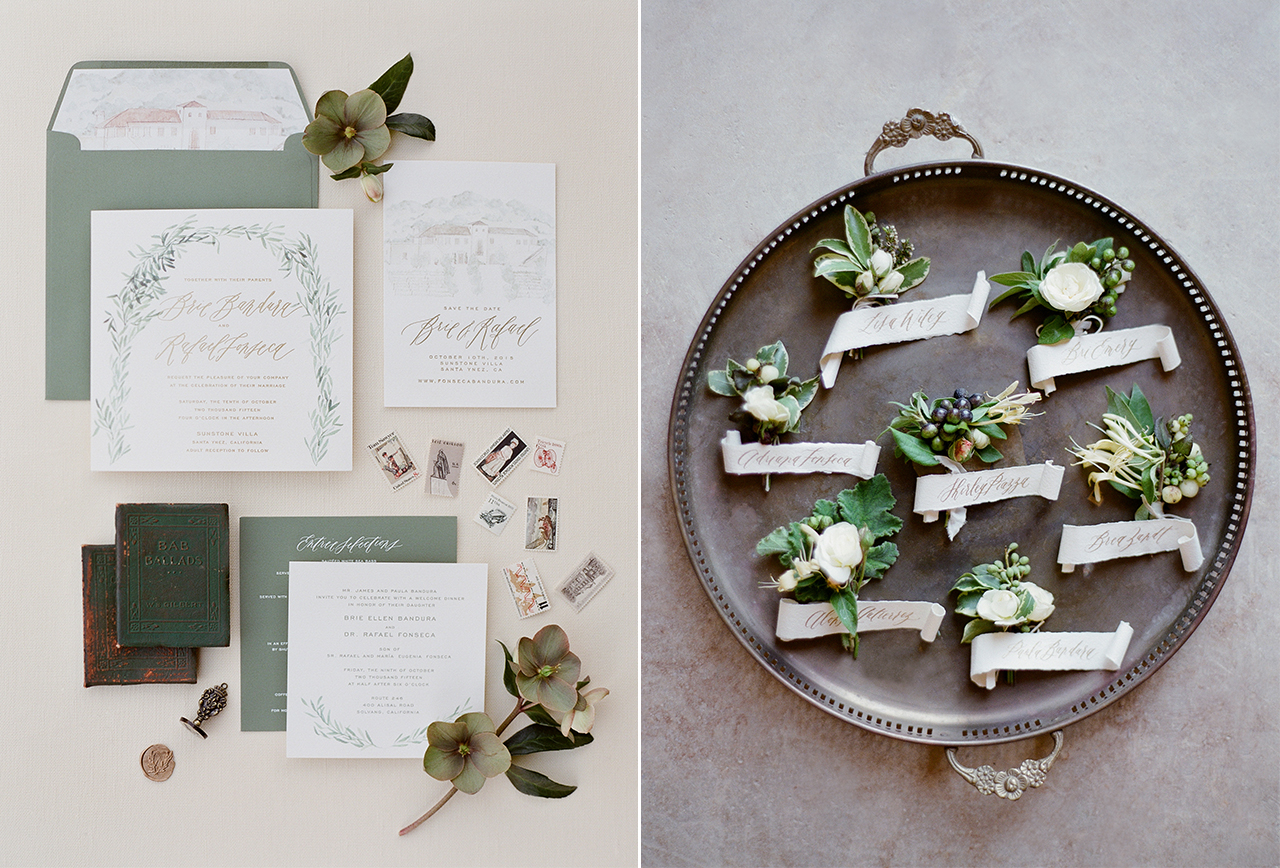
If you spend any time on social media following some of the top lettering artists then we are sure that artist Karla Lim of Written Word Calligraphy feed is already on your radar. Lim’s beautifully, graceful dancing hand and perfectly styled images are a visual feast and now with the launch of new product offerings (wax seals!) there is even more to look forward to! We were so honored when she wrote us and said, “Like many calligraphers out there, a lot of us started because of your blog! I learned so much about what pens to use and what nibs to get.” When we started the idea of promoting lettering (once we heard handwriting would no longer be taught at school’s) we had no idea what an impact we would make and to read something like that and to see all the plethora of talent now lettering with such enthusiasm and style makes our hearts soar. We are thrilled that Karla has agreed to be interviewed for our series! Please find part I below:
Where are you located?
Vancouver, Canada
How did you get started in lettering?
I’m honestly no longer sure about this question! I started exploring lettering when I was very young, in elementary, as I was very fascinated with my parents’ handwriting, and eventually all my friends handwriting as well. I observed all of them very closely as I developed my own lettering. I also did a lot of illustrating and painting throughout my childhood. When I was in university, I travelled through Europe quite a bit, and that’s where I first held my calligraphy pen. I didn’t use it for calligraphy though, I used it for line art and sketching. Only about 5 years ago that I started exploring the calligraphy pen for my own lettering.
What are some of your favorite supplies?
I love Paper Ink Arts’ penholders, and I love my Blue Pumpkin nibs and Hunt 22’s. For gold ink I still absolutely love my Dr. Ph Martin’s Copperplate gold. For paper, I love bristol paper for all my sketches and transfer work, but for handmade paper I love Shoppe Signora’s (Katie Decker’s) gorgeous paper.
Can you name some of your inspirations?
Signora e Mare, Neither Snow, Maybelle Imasa-Stukuls, Feast Calligraphy. They inspire me because not only is their work absolutely beautiful, but they’ve been able to expand various parts of their business that best reflects their strengths and passions. Katie for example, has expanded into having a successful vintage curated shop and a handmade paper maker. Maybelle is everywhere with her calligraphy kits, and making influential decisions as she goes along.
Can you go a little into your process of how you work on a project?
I always start with a sketch. I love using my pencil (2B) because it’s very light, and I am able to vary my work in the process. I use it merely as a guide for placement. I then trace over with my calligraphy pen. I’m terrible at tracing, but that’s part of doing modern calligraphy. Once I write it over in calligraphy, I push the boundaries of each letter on where it should go. If I need to modify it, I would trace it over again with vellum paper, to make it perfect, yet still imperfect. The beauty of modern calligraphy is really in its intentional imperfection.
Read part two of this post here.
Karla's Shopping List
Paper Ink Arts’ penholders
Blue Pumpkin nibs
Hunt 22 nibs
Dr. Ph Martin’s Copperplate gold
Bristol paper
2B Pencils


