Julie Song
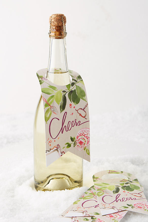
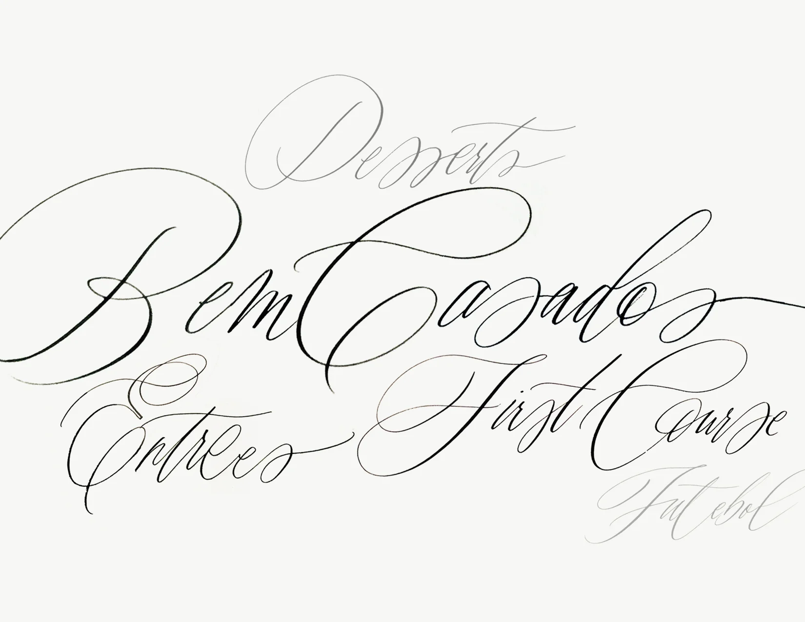
I can’t believe I have been sitting on this interview for so long, granted I hope I have a good excuse and I pinky promise it is so worth the wait. Today’s featured lettering artist is Julie Song. One of the reasons I reached out to her is because she is doing some spectacular work with her watercolor lettering, it’s just very fresh and original and I just know she is going to become one of your favorites (as she is one of mine). She does wedding work of course, but some of her recent logo work has me wishing I was as gifted. Lucky for us she is generously sharing her ‘secrets’ with us. Please feel free to leave questions in the comments and as always it’s so appreciated when you leave a nice note for our interviewee so don’t be shy and let her know how grateful we are! Without further ado…
Where are you located?
Currently in Oakland, California.
How did you get started in lettering?
I think I got into drawing bubble letters as a kid through some artsy relatives, and then somehow that evolved into me trying to turn every school assignment into an art project. I remember having to write a report about the Medieval period, and then buying a gold calligraphy pen so I could write it in a gothic hand on a parchment scroll, kind of like an illuminated manuscript. I’m sure it was horrible, but you gotta start somewhere :)
What are some of your favorite supplies (inks, brushes, nibs, paper)?
I think this is fairly common, but I love Sumi ink for so many uses, and enjoy using round watercolor brushes for brush-y lettering. But I love trying anything and everything to see how it writes, including Chinese brushes! I have a variety of nibs, but I’ve been using the Zebra G the most lately. I generally write on grid paper, especially if I need to write particularly neat or straight.
Can you please discuss any watercolor lettering supplies or techniques?
As I mentioned above, I love round watercolor brushes because they can hold a point well. I actually use some generic Blick brushes, but I keep buying new ones when the tips start losing their points (and I should probably take better care of the ones I have by not leaving them pointing down in the water too long!!). It’s nice to experiment with different sizes depending on what effect you’re going for. In terms of the paint, I tend to mix about a 40/60 ratio of paint to water, but again, this may vary depending on how transparent I want the lettering to look. Or I will use watered down gouache if I want it to be a bit more opaque. On technique – ironically, it seems to take a lot of tries to make something look spontaneous, so I seem to end up using more paper than I’d like!
Can you name some of your inspirations?
I’m of course very inspired by calligraphers like Neither Snow and Maybelle Imasa-Stukuls, who can do no wrong! I’m also fond of signatures of painters like Joan Miro – or even anyone’s signatures for that matter. I love their efficiency and personality. And I know this is cheesy, but I’m always inspired by children’s drawings in all their awkward splendor, and save all of my niece’s and nephew’s art for inspiration. I guess I agree with Picasso, I seriously hope to draw like them someday.
Can you go a little into your process of how you work on a project?
For projects involving hand-lettering, I typically write the wording out as close as possible to scale, and then scan it in at 300 dpi or higher resolution. There is often some cleaning of rough edges in Photoshop or Illustrator (unless of course it’s part of the look!)
Any tips for newbies on how to develop their own style?
Make a lot of different marks and then keep pushing the ones you like best! One fun thing to do is to experiment with everything, from writing tools to surfaces…even writing with things like feathers are fun just to see what marks you can make! A glass of wine is a great tool too …I think loosening up usually helps :)
Any recommendations of books or classes for lettering enthusiasts to further their studies?
Everyone probably already knows this, but I know Maybelle provides classes all over the world. For book inspiration, I love any and all typography books to see how people are using letter forms, such as Louise Fili’s Elegantissima.
Do you have some favorite projects you would like me to mention?
I’ve started to slowly populate my Society 6 and Etsy shops again with some fun (but maybe not very marketable) products! I also love combining gold foil and letterpress with watercolor; in particular, a recent rustic invitation suite involved the combination of letterpress and embossing with vibrant watercolor and hand-lettering on handmade paper, with other handmade details like stitching and wood paper, dried caspia sprigs, and stitched linen menus. I think this was one of most handmade detail-heavy projects I’ve done, but I think it helped convey the personal effort the couple put into creating a special wedding weekend for their guests. There are some peeks of this on my Instagram feed.
Any advice on what ‘not’ to do?
Yes! Don’t let your desk get so messy that your inkwells sit precariously at the edge of your desk, and then knock them over with one fell swoop, spraying black ink all over your white walls. And don’t put your paint water right next to your drinking water. But in seriousness, I think it’s important not to be afraid of mistakes, because sometimes you’ll love how they turn out.
Name one random talent you have that people may not know?
Carving rubber stamps. I used to carry around an X-acto knife at all times as a kid so I was at the ready. Until they confiscated it from me at the airport. So sad.
Julie's Shopping List
Sumi ink
Round watercolor brushes
Chinese brushes
Blick brushes
Gouache
Zebra G nib
Elegantissima by Louise Fili


